Ticketmaster Event page
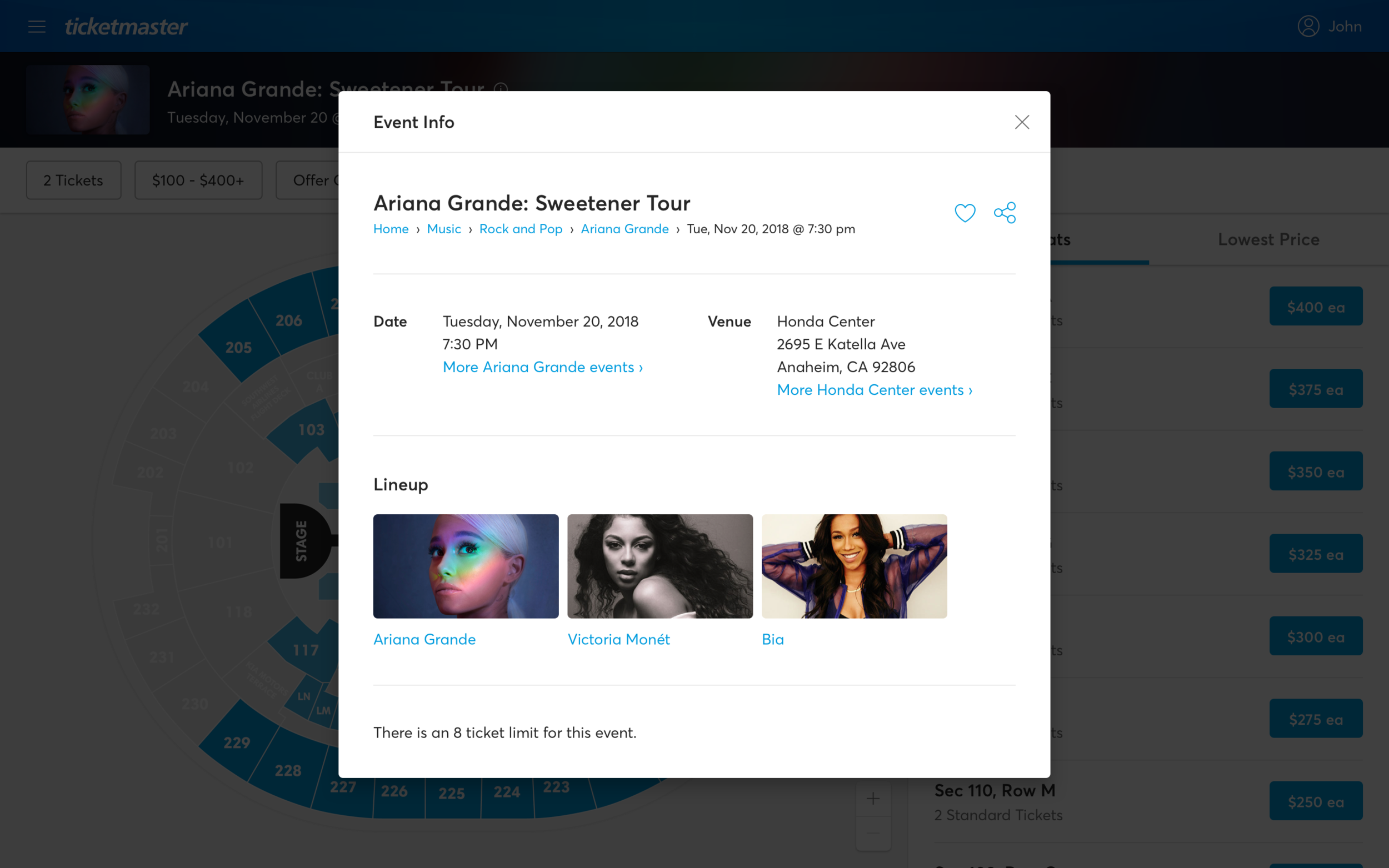
Ticketmaster’s Event Page is one of the most important consumer-facing parts of its website and apps, being the place where fans browse and shop for tickets and get event information. As a cornerstone of Ticketmaster’s e-commerce business, it was important to me to improve upon the previous version of the event page with usability improvements and emphasize higher click-through rates to checkout. Along with UI/UX improvements, I made sure the event page integrated rebrand and design system changes, complied with client needs, and aligned with business goals.
Scalable and Responsive Design
Before given the task of unifying the ticket purchasing experience, the mobile apps, mobile web app, and desktop had vastly different user experiences. It was top priority for me to make the user experience consistent across all devices and platforms, along with making it responsive and fluid.
All Bases (Cases) Covered
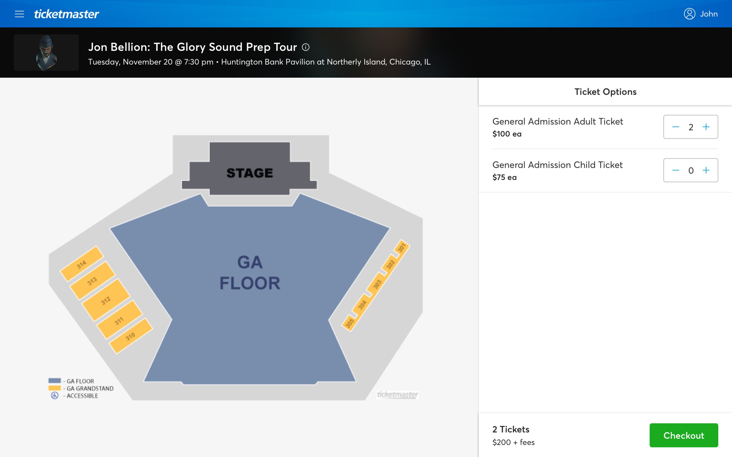
Ticketmaster covers a wide range of event types, from reserved seating to general admission to festivals and many more. I made sure I created a platform that covers every use case while still maintaining a consistent user experience across all events.
Show Me the Money!
Along with improving the user experience, I made sure that the new event page increased conversation rates and ticket sales. Extensive feature rollouts (both minor and major changes) and A/B testing were done to fine-tune the UI to maximize conversion and meet business goals.


